Visually appealing web pages are key to enchant end-users to not only visit but take action when on your page. User interfacing, page structuring and style information are also vital for developing a web application. Though it is almost impossible to develop a web app without CSS, it stands out among other programming languages. In early 1990s, HTML was the only programming language to layout a web page, and developers had to painstakingly code and style each individual page of their app or site. The introduction of CSS was a huge relief, allowing developers to more easily dictate how HTML elements are presented on a page. Unlike other languages however, CSS was not structural and there were no well-defined approaches to follow, making it difficult to maintain and scale the code.
In fact, there is an ongoing debate on whether HTML and CSS are even programming languages. Some argue that they are just “page structures and style information”, while others refer to them as “Domain-specific programming languages”, where the “domain” is the web browser. Language or not, the fact is, no webpage can be formed without them both so some standard methodologies are imperative to creating clean, repeatable and scalable code.
Writing CSS codes that are not a mess could be tricky. CSS by purpose, is a set of rendering instructions that are parsed by an engine. However, here are five CSS development methodologies and style guides that can help you more efficiently build and maintain your CSS and HTML code:
BEM (Block, Element, Modifier)
“BEM — Block Element Modifier is a methodology that helps you create reusable components and code sharing in front-end development.”
BEM methodology in CSS is a component-based approach for web development where the idea is to divide the user interface into various independent blocks. Its intention is to help developers better understand the relationship between the HTML and CSS in a project. All selectors in a BEM have the same weight which makes it much easier to redefine styles written according to BEM methodology. In BEM, the block can have different elements, and both block and elements can have several modifiers. The best way to use BEM is with classes and not to use IDs because classes allow you to repeat names if necessary and create more consistent coding structure. The main advantage of
BEM is it defines the individual task of each tag and their relation to another.
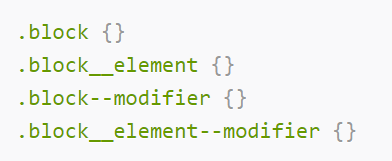
- Blocks are independent components in a page they can be header, content, sidebar, footer, and search. A block name is always unique, setting the namespace for elements and providing a visible connection between the block parts. CSS class is formed as just the block: .block
- Element is a component inside the block that performs a particular function. Any element is semantically tied to its block. An element can be for example, a text input box with a button. Class is formed by the block name plus two underscores followed by the element name: .block__.element
- Modifier is how we represent the variations of a block. For example, the button being color red. CSS class is formed with the block or element’s name plus two dashes: .block__.element--.modifier which is an element modifier or the block-level modifiers can be directly attached to the block like: .block- -.modifier
OOCSS (Object-Oriented CSS)
“OOCSS - treats page elements as objects, giving all objects classes, treating the objects’ classes as single entities in style sheets, and taking it from there.”
Object-Oriented CSS methodology has a lot in common with the object-oriented programming approach because when using it, we create default objects. OOCSS supports code reuse and provides ultimately faster and more efficient stylesheets that are easier to maintain. OOCSS promotes heavy reuse of CSS codes, to reduce the code size. A characteristic feature of the Object-Oriented CSS is freedom, because there are only two rules:
- Separation of structure from skin: define repeating visual features as separate skins that you can match with your various objects. In other words, structural styles and skin styles should be written separately.
- Separation of containers and content: rarely use location-dependent styles. That is an object should look the same wherever you put it and child-selectors should be used less.
SMACSS (Scalable and Modular Architecture for CSS)“SMACSS - a flexible guide to developing sites small and large. Arguably becoming one of the most useful contributions to front-end discussions in years.”
SMACSS is a way to dig through your design process and fit those static frameworks into a flexible thought process. SMACSS allows the creation of a scalable CSS architecture divided into modules to obtain a reusable code. This method is apt particularly for larger projects as the folder structure itself defines its specific responsibilities. SMACSS project structure uses five categories so that our CSS files gets a clear, readable structure.
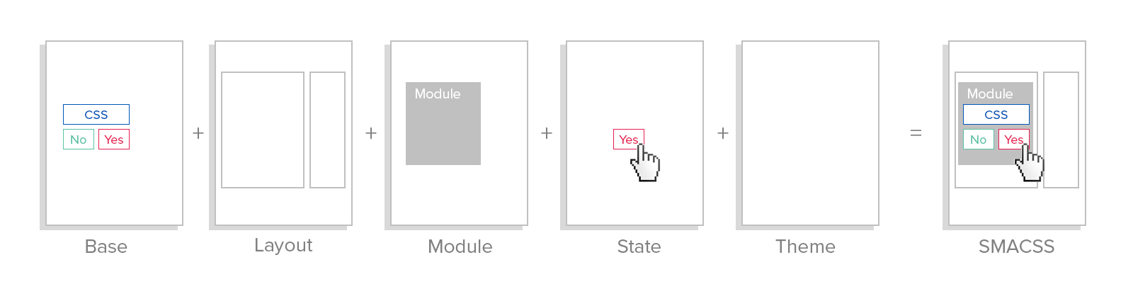
Base are the default values used across the entire website for all elements. This ensures that your resulting style sheets are consistent across browsers and give a feel and look that they are unique across the solution.
Layout styles will divide the page into major sections with the responsibility to properly position the elements on the page creating its perfect structure. This will hold modules like header, footer, sidebar, boxes, cards etc. It can be reusable elements or those that appear only once on page.
Module contains reusable blocks. It represents separate and independent page fragments that has specific functionalities, like navigation bars. They will be mostly inside layout components and even within other modules.
State is used to denote the variations possible for each element. A state style is one that augments other styles under given conditions. For example, an accordion with expanded and collapsed states.
Theme is akin to state but defines how modules and layouts will look. Mostly these are elements that repeat across the whole project like the rules of the primary colors, shapes, borders, shadows, and such.
Atomic CSS
“Atomic CSS is the approach to CSS architecture that favors small, single-purpose classes with names based on visual function.”
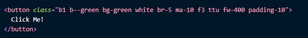
Atomic CSS simply defines a set of classes representing single-purpose styling units. It solves some of the traditional CSS issues using classes that are considered single-purpose styling units. This methodology aims to provide highly granular and reusable styles, instead of rules for every component. This can reduce the specificity conflicts and tries to make the styling more variable in a predictable manner. This method helps in reduction in redundancy of code and the confusion of overriding CSS styles. The advantage to this methodology is that it has a lower barrier to entry and is more easily understood by those who are not well-versed in CSS. This approach can handle longhand or shorthand class names (longhand would be more readable whereas shorthand favors brevity). In essence, Atomic CSS is One Rule for One Styling.
ITCSS - Inverted Triangle CSS
“ITCSS – a sane, scalable, managed CSS architecture achieved with mindful CSS code organization.”
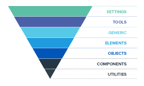
ITCSS helps you organize your CSS files in such a way that you can better deal with CSS specifics like global namespace and selectors specificity. ITCSS separates your global CSS codebase into several sections to form an inverted triangle structure. This method provides a solid level of encapsulation so that it can prevent non-shared CSS-rules from interfering with each another. Unlike other methodologies ITCSS is very flexible as it does not force one to use any naming convention.
The main pattern followed in this methodology is the low to high specificity. Least specific, mostly generic selectors will appear at the start of the project and the specificity will steadily increase. This will be helpful to reduce specificity conflicts. So, each layer of separation will be a logical progression from the last. Thus, CSS will be easier to scale.
ITCSS layers can be ordered as:
- Settings layer can define all the variables,
- Tools layer can be used for tooling purposes like declaring mixins and other functions that are globally required.
- Generic layer can contain all the normalized, high-level, far-reaching styles.
- Elements can hold the styles for bare HTML elements and can redefine the default styles for those elements in this layer.
- Objects layer has styles for the first elements that have classes (like containers, wrappers, rows etc.).
- Components can house most of the UI element styles.
- Utilities classes can override anything that goes before in the triangle.
ConclusionWithout CSS the web would be “vanilla” and not the revolutionary, colorful and stimulating medium that we currently enjoy. Proper structuring of CSS and the DRY (“Don't Repeat Yourself") principle are common goals regardless of which method you choose. Each tackles the maintainability and scalability problems in CSS by providing a class-based system for breaking up large web designs. It is always recommended to follow any one methodology as such or take away the ideas and devise your own class-naming conventions that work best for you.
Our skilled developers at Valorem Reply have years of experience building and optimizing engaging human-technology experiences that achieve business goals. These are just a few of the best practices our teams use every day to create innovative digital solutions that make an impact and drive results. If you have an important development project on the horizon, our experts can act as extensions to your team to help you ensure best practices and reach your goals quickly and efficiently. For more information on our AppDev/DevOps solutions and capabilities please reach out to us at marketing@valorem.com.