What is affordance?When you walk in a new place, how do you know where to sit? The floor, the counter, a shelf, a plant? I know you’re saying, duh a chair. But if you hadn’t seen others do it before, how would you know that a chair is for sitting? Answer: It sits about knee height and appears to provide support. These characteristics are visual cues creating what is known as affordance.

Affordance is when an object’s sensory characteristics indicate how it could or should be used. Sure a chair is an obvious one, but think about the last time you encountered a new app or website. Did you know immediately how to use it or where to find the information you were looking for? In the digital world, affordances can only be conveyed in 2D, making it more challenging to show users at first glance how to use your app or navigate your site. Even the slightest considerations around your affordances when creating a new digital tool can have drastic impacts on whether your end users will like and use the tool and as a result the return on your investment.
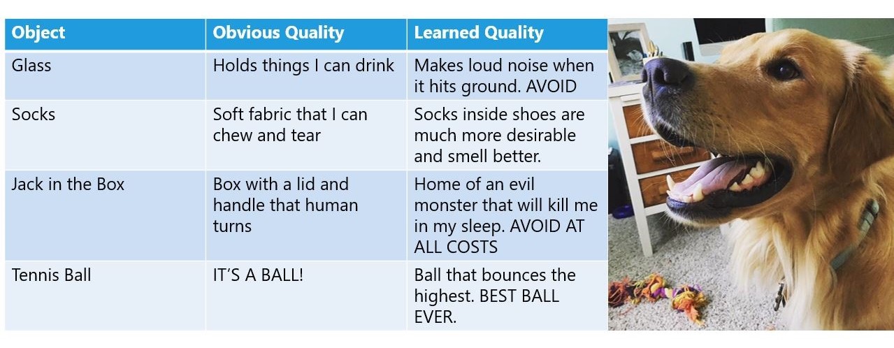
The term affordance was coined by James Gibson (1977, 1979) and originates from ecological psychology. An affordance is a relational property – it is determined by the relationship between the user and environment rather than by the environment alone. Those relationships can be obvious and learned and they can vary based on the user.
Obvious vs. Learned Affordances for Humans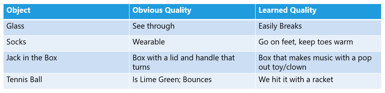
Obvious vs. Learned Affordances for Dogs:
Why is affordance important for your business?The era of digital transformation is upon us with growing pressure on business leaders to invest in new technologies that promise modernization, efficiency and scale. A major component in the success of these investments is how well the resulting new tools are received and optimized by the end user. The way a user feels about a digital product, system or service is referred to as the User Experience (UX). Digital buyers of today must not only chose the right technology to fit their unique business needs and budget but also one that stakeholders will accept and use to its fullest capacity. After all, what good is having the latest and greatest technology if no one wants or understands how to use it?
The function of user experience in the digital transformation journey is to design expertly crafted and intuitive human - computer experiences that both engage and delight end users while maximizing an organization’s technology investments. The key is to design digital tools for 4D accustomed users that are easy-to-use, efficient and effective using 2D affordances. In order to do this, web designers typically employ 6 types of affordances when strategizing, building and implementing new digital solutions..
6 Digital Affordances to Consider in Your Design
1. ExplicitExplicit affordance is language or appearance characteristics that clearly signal how to interact with an object, even if the user has never been exposed to it before. Obvious cues like ‘click here’, ‘add to cart’, ‘checkout’ etc. buttons are good examples of clear and explicit affordance in which any user understands what to do. Explicit affordance is most important when the end user has little exposure to a new design or web pattern. For example, tools created for use by children or older generations who have not had high exposure to digital tools would need more explicit elements incorporated throughout the design.

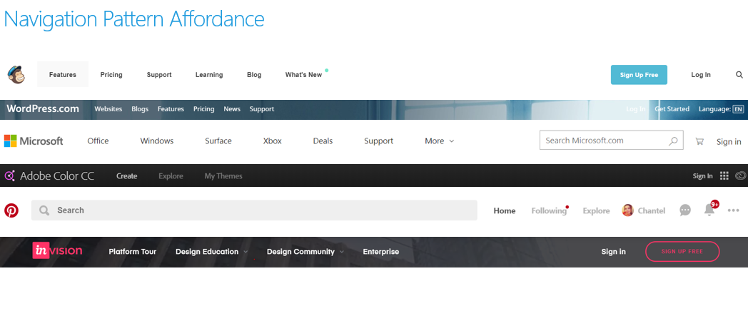
2. PatternPattern Affordance is the most common type of affordance in modern user interfaces. These are elements that are regularly and widely used and reused to convey meaning. For example: underlined text equates to linking to another page, navigation elements are almost always presented at the top of a screen, and left to right placement of elements in order of importance are all patterns. Pattern affordances rely on the wealth of time we as a mobile-first, cloud-first society have already spent interacting with apps, websites and other interfaces. They harken familiarity and are consistent regardless of the digital property and therefore become an almost subconscious understanding to end users. The hamburger menu is a good example of a pattern affordance. Upon introduction users who were more accustomed to the explicit “Menu” option on a navigation bar were confused when presented the icon. Today the hamburger menu is so commonly used it has become a pattern affordance that is easily and widely understood to indicate quick navigation. Pattern affordances are important to keep in mind when creating tools for international use and/or niche industries as each audience segment may be accustomed to different visual cues.
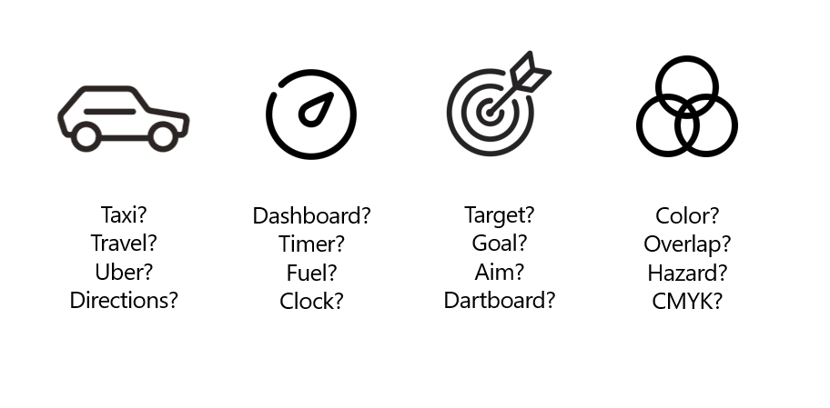
3. MetaphoricalMetaphorical Affordance is when real world objects are used as metaphors to convey an action. Metaphorical affordances usually are represented with icons or logos and some are so prolific they have become a pattern affordance. There are many examples of metaphorical affordances in web design.
- The Floppy Disk represents save. This icon has transcended its original meaning as many children born post 2000 only recognize the icon for its metaphor and not the floppy disk.
- Magnifying glass represents search
- Envelope represents email
Metaphorical affordances have been around long before the birth of the internet. Traffic signs use metaphorical affordances to convey interactions and rules on the road. But there are some drawbacks to using metaphorical affordance as some icons can represent a multitude of real-world applications and on some occasions an icon cannot properly convey the necessary amount of context to an end user.
Strong metaphorical affordances:

Weak metaphorical affordances:
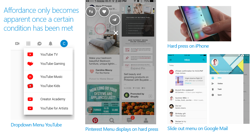
4. HiddenHidden Affordances become apparent only once the user has taken some action or a certain condition has been met. Hidden affordances have become more widely used as devices have become smaller and designers are finding ways to keep the same amount of information in a limited space. An example of this is when you are required to hover over an image or press and hold an icon (also known as a hard tap) to see additional options, like slide out menus. Apple products employ a variety of hidden affordances to help users quickly navigate to and change their apps. Another type of hidden affordance is the appearance of additional options once other options are met. For example a clothing retailer may ask you to select a size before revealing color options. While hidden affordances are becoming more commonplace and slowly transitioning into a pattern affordance, it is a risk to use hidden affordances for primary actions. Hidden affordances require some user experimentation and discovery, which can result in an unintuitive experience and a higher training budget to help users understand how to use the tool.
5. Negative
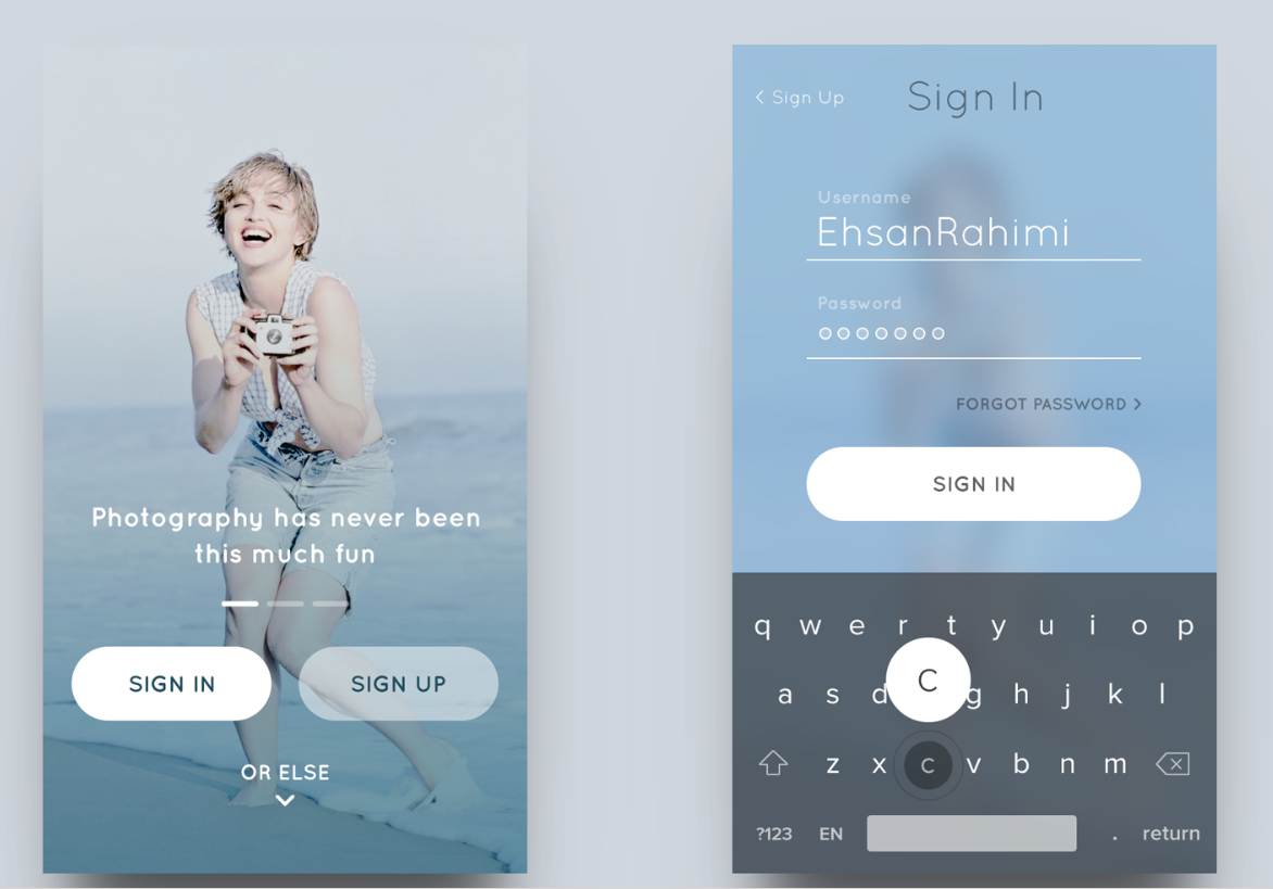
Negative affordances are used to signal to end users that an element does not afford any action at any given time. In user interface design there are many instances where elements are designed to indicate they are not available for use, usually because a precondition has yet to be met. For example, a user is signing up for groceries to be delivered to their home and they have yet to provide their street address. The “Create Account” button has a negative affordance such as greyed out or faded coloring and cannot be clicked, until the user provides all the necessary information for the account to be created. Another good example is when you are shopping online for an item that comes in several size or color variations. If the specific variation you are looking for is unavailable due to inventory shortage or manufacturing limitations, you will often see those selection options crossed out or grey.
In this screenshot from Ehsan Rahimi, the sign-up interaction uses negative affordance to affirm the password has been provided:
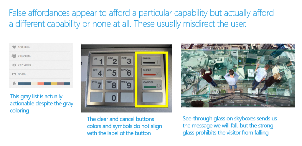
6. FalseFalse affordances convey a capability but affords a different capability or none at call. These affordances misdirect users, which is why in a UX practice identifying and correcting false affordances is key. False affordances usually are caused by perceptional knowledge being contradicted by reality. For example, if a person were to visit the Sears Tower in Chicago, they could visit a skybox. The perception once you enter the skybox is that you will fall to the street below, but reality of the situation is that the see-through glass prohibits you from falling. The clash of the human perception and the reality of the interaction create a false affordance. With a user interface this can occur in multiple ways such as:
- A user clicks a “Marketing” link, but they are not taken to the marketing link, but to the service page instead.
- A cancel button is colored green
- Actionable buttons appear to be disabled
False affordances cause confusion and can manipulate users into questioning their reality and their own intelligence, which is why these should be avoided at all cost and are usually reported as bugs.
SummaryAffordances are all around us. As we shop, interact, play, and learn they shape how we see our world and use the digital platforms around us. Acknowledging affordances in the design, build and testing is essential in digital transformation as it provides the fundamental instructions for end users, assists with adoption and change management, and can be used for measurements of success. In the era of digital transformation, a strategy that includes user-led design will ensure the new tool you create or update will communicate the affordances that best meet your end user’s needs and ensure the intent of the application is perceived and actionable for all users.